Friday, July 29, 2011

Christmas In July


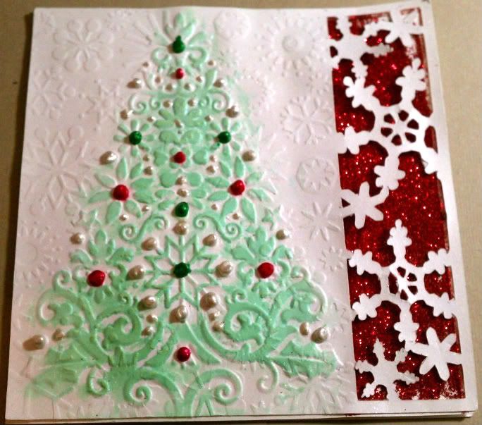
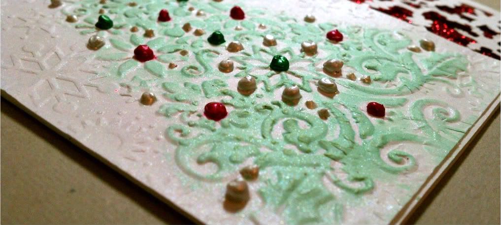
So I decided to revamp a Christmas card idea I have had for quite awhile.  I started with a snowflake border on my computer for a 5x5 card and cut it out using my Cricut.

After I cut the image, I ran the paper through my Big Shot with the Cuttlebug Snowflakes folder and again with my Lace Tree folder to soften the snowflake impressions slightly.

I used some red glitter from my stash to bring out the snowflake design.  I wouldn't recommend glitter for an area this large as it gets messy!  For future cards, I will use the American Crafts glitter card-stock.  It cuts cleanly and there is no glitter residue to be found weeks later on another project :o)

After the glitter was added I glued my embossed/cut image to the card.  It was still missing something, so I sprayed some Lily Pad glimmer mist on a tissue and ran the tissue over the raised image of my tree.  Once it was dry, I sprayed the front of the card with Dazzling Diamonds glimmer mist to add overall shimmer.  Doesn't it look pretty?


For the next step, make sure your card is completely dry!  I didn't check and noticed after the fact and had some ink running.  I used 3 different Perfect Pearls to accent "ornaments" on the tree.  What do you think??  Definitely a lot of work for a Christmas card, but you are waiting for the card to dry so much in between that it is actually pretty easy to reproduce like a production line.

thanks for looking!

Photobucket


Image: n/a 
Paper: Bazzill Simply Smooth 
Ink: Glimmer Mist: Lily Pad, Dazzling Diamonds
Embellishments: Perfect Pearls: Emerald Green, Ruby RedWhite Opal
Other: ATG, Big Shot, Cuttlebug -Lace Tree (retired), Snowflakes, Cricut
Stash: red glitter

Wednesday, July 27, 2011

Copic Organization

So I just got the best thing EVER!!!  I was able to order 2 Copic Wallets from Cutterscreek and they came in this weekend!  I love how much more accessible my markers are now.  I have 2 completely full and am working on filling a third one.  Bytheway, I have the 72 count wallets.  Don't they look cool?  Plus I found out it holds sketch, ciao and original markers so I have them all in one place now!  I am so excited!!!


Photobucket

Monday, July 25, 2011

Summer Birthday Cards


 So I was looking through my Color Inspiration Magazine that came out earlier this year and I got an idea.  Not so much the colors but the layout.  If you have it, it's on page 46 - Spread Sunshine.  I just love this simplicity of it, so here are some simple birthday cards I came up with.


I really like the look of white ink on black paper, so I wanted the white to look a little messy on the embossed images.  The first card I used Flourished Frame and added the white ink and flowers after stamping my words on some Kraft paper from my scrap paper.  Who says brown and black don't go together :o)  I topped it with someCuttersCreek branded and Prima flowers.


This card I also embossed, but with one of the images from the Organic Flourish Collection.  I also used white to enhance the embossed image but no where else.  I just really like the simple feel to it.  Both cards took maybe 10 minutes total so this was perfect for a card in a hurry or  making some for your stash of birthday cards.  And they look completely different!


thanks for looking! 

Photobucket

Image:  Stampin' Up -retired
Paper:  stash
Ink: Memento Tuxedo Black, white ink from stash
Embellishments:  Prima Flowers: Dimmet, Aurora. CC Flowers: Aqua Marine, B, W, GOrganic Flourishes, Flourished Frame.
Other: ATG,  Glue Dots, Big Shot

Monday, July 18, 2011

Copic Portfolio

So I decided to update my Copic Portfolio with an image I used quite a bit by *Princess Elemmiriel.  Using my copics I colored my image focusing on lighting.  I have the sun coming from the upper right, so the shadows would be on the right of the body and more specific areas like where her waist is bent, the arm slightly covered by her dress, where her hair covers her face and dress, her nose, and what would not be hit directly by the light.


Definitely one of my favorite images to color.  The main reason I put this image in my portfolio is because of the size.  Usually when I color this image, I tend to use a larger version and the card ends up around 5x7.  This image was printed at 2x3 so it was a challenge to color with the shading at so small a size.  I really like how it turned out.                                                                                                                        Are you working on a portfolio?  It is a good reference tool and it helps you have a comparison of how much your coloring has progressed from when you start.  It is also a good way to keep track of favorite color combos, techniques and samples you have made.  I tend to color two of every image I use as it helps me practice in a way, but also I can get two cards done at once but that also can turn out so differently from one another.

thanks for looking!


Photobucket

Ink: Memento Tuxedo Black, Copics, Copic Multiliner
Embellishments:
Other: ATG,
Stash: green paper